Showing posts with label set design. Show all posts

Sunday, August 13, 2023

Cinematically Inspired Design - Check it Out!

Today we have a real treat to share! A few months ago I stumbled upon a great website called Mockingbird Lane where a cinema-loving woman named Marina Coates shares her love of architecture and design....especially set designs found in films and television series. Two great features of the site are her virtual TV/Movie Home Tours and her Cinematically Inspired Design tutorials. 

The TV/Movie Home Tours began with a behind-the-scenes virtual CG tour of the Petrie home from The Dick Van Dyke Show and has since grown to include the Bewitched house, Lucy and Ricky's apartment and country home from I Love Lucy, the Family Affair apartment, the Cleaver's home in Leave it to Beaver, and many more from classic TV shows. These are fantastic videos that show you all of the details of the houses you have seen countless times on television. Most are 15-25 minutes in length and honestly, you feel like you are walking in the house with a tour guide listening to fun facts about the show and all of the items in the house. 

She also has virtual tours of famous film houses like the North by Northwest house, The Parent Trap ranch, and the Inn from White Christmas. You don't want to miss these so be sure to check them out! 

Look familiar? It's the Ricardo's country house.

The Cinematically Inspired Design tutorials are even more amazing. Here, Ms. Coates shares her architectural experience with us and gives in-depth analyses of why the interiors of classic cinema houses look so good and tips on what we can do to improve our own interior designs. If you ever wanted to attend a class on classic Hollywood set design, this is it. 


If you are an art design nut like ourselves, then be prepared to set aside hours enjoying these videos!

Friday, October 30, 2020

TV/Movie Set: Bedknobs and Broomsticks ( 1971 )

It has been a long, long time since we have featured a TV/Movie set article, so to bring the series back to life, my sister and I selected a house design that we have loved for years - the Bedknobs and Broomsticks manor. It's so fitting for this time of year, too. 

This beautiful English Tudor belonged to Eglantine Price ( Angela Lansbury ), the heroine of Bedknobs and Broomsticks, a bewitching 1971 musical from Walt Disney Studios. The film tells the story of a would-be witch who attempts to learn the secret of the missing spell of "Substituiary Locomotion" in order to help England defeat the Nazis during World War II. 

Miss Price's secluded house overlooked the chalky white cliffs of Dover. It was an ideal place for her to practice witchcraft without the citizens of Pepperinge Eye knowing what she was doing. She was disappointed to get saddled with three orphaned evacuee children from London, but once they learned that she was an apprentice witch, they come to her aid and help her to locate the missing spell.

Here is a quick sketch of the layout of the interior of the house. Since only one side of the living room was shown, I left that part of the sketch undone. 

Let's take a look at the house more closely with some screenshots......

EXTERIOR

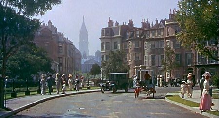
John B. Mansbridge, a fabulous art director who was in charge of many of Walt Disney's productions throughout the 1960s and 1970s, was the art director of this film and he did a beautiful job of recreating a World War II-era English manor. Peter Ellenshaw is also credited as art director for the production, but since he was a matte artist, most of his work was probably painting the exterior shots of the house ( see the two screenshots above ). 

Like many old manor homes, Mansbridge designed the house to look like it had a number of additions added to it over the years. The "original" house did not have a kitchen, so as you can see in the sketch, it is one of the additions and located off the living room instead. 


When Miss Price first arrives home with the children in tow, we see a glimpse of a stone wall behind her. Later in the film, this would be the wall that the Nazis attempt to climb when they attack her house. 

Miss Price's house is very strongly built. The local clergyman ( Roddy McDowall ) knows this, too, and when he comes to deliver a telegram for Miss Price he tests out her porch by jumping up and down on it! He wants to have her house as his own, although the reason why is never expanded upon in the script. 

LIVING ROOM

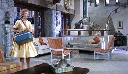
Our first view of the interior is the living room. Isn't it charming? Miss Price's house is filled with numerous chairs, bric-a-brac, and lots of pictures hanging on the walls. The old beams add character to the place and it makes one think of the interior of an old inn. 


In this scene, Miss Price is heading towards a closet to stow away her new broomstick and below we see the stairs leading up to the room which she will give to the children to use. 

You can see the dining room behind Miss Price in this screenshot:

When the Nazis take over her house ( because of its prime location overlooking the Channel ), they make the living room their "headquarters". That's John Ericson as the handsome young Nazi captain. 


Emile Kuri and Hal Gausman were responsible for the set decoration and they did such a wonderful job. Both Kuri and Guasman had worked as set decorators on other Disney productions such as The Parent Trap ( 1961 ), Mary Poppins ( 1964 ), That Darn Cat ( 1965 ), The Secret of the Pirates Inn ( 1967 ), and Blackbeard's Ghost ( 1968 ). 


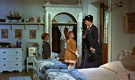
As Miss Price leads the children up the staircase we see lots of prints of hunt scenes and animals on the wall and, in the children's room, there is a picture of a military officer and battle scenes which gives us a hint into the character of Miss Price's father ( it was once his house ). 

CHILDREN'S ROOM


The fact that Miss Price left his room unchanged and told the children to "be very careful of everything in it" tells us a little bit about her character. 

Carrie is given the devon to sleep on and the boys will share the brass bed. Later, this becomes a traveling bed when the famous "traveling spell" is applied to one of the brass bedknobs. 

It's a plain room, but it gets plenty of light from the window. It could do with some new wallpaper, however. 

"Now how's a ruddy big bed like that going to get out of this room with those little windows?" asks Charlie. He's at the "age of not believing" and doubts magic altogether. But as you can see, the bed does indeed whisk itself away!

DINING ROOM

We don't get to see much of the dining room in the film. It's small but cozy. Miss Price serves the children cabbage buds, rose seeds, and other vegetarian goodies. The kids naturally like Mr. Brown's cooking better - he makes sausages and mash!

KITCHEN


Speaking of Mr. Brown, here he is. This floundering magician helps Miss Price in her hour of need and the more time they spend together the fonder she grows of him. He was portrayed by that wonderful English actor David Tomlinson ( Three Men in a Boat, Mary Poppins ). 

The kitchen is very bright and cheerful and has a beautiful hearth stove in one corner. Miss Price also keeps the pantry well stocked with garlic ( does she believe in vampires, too? )
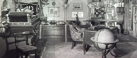
THE WORKSHOP


Just off the kitchen is a storage room which we only get a glimpse of when the door to the workshop is open. This is the entry way leading to Miss Price's "witching room". She practices all of the latest spells from Mr. Brown's Correspondance College of Witchcraft here. 

She was especially excited when she got to fly her first broom. Cosmic Creepers, her cat, watched as she came tumbling down from the sky after her first attempt. It takes some practice to work a broom properly. 
Miss Price didn't have too much luck the first time she tried the Substituary Locomotion spell either and the household wardrobe began to take on a life of its own. 


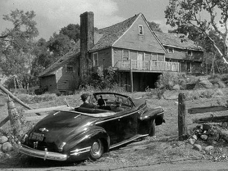
At the end of the film we see this view from the front of the manor. I wonder if Miss Price knew what a prime piece of property she owned! Perhaps she did, and that was why she wanted to defend her corner of England...even via witchcraft. 

Monday, March 13, 2017

The English Village Setting of the 1940s

Films are by far the most marvelous means of personal escapism and during the 1940s, a time of war, anxiety, and sorrow, the American people certainly needed a place to escape to. Hollywood, being a most benevolent servant of the Arts, created and then delivered us to our destination. They gave us the storybook English village - idealistic communities home to gentle townsfolk such as the local minister, the elderly matriarch ( often played by the great Dame May Whitty ), the gossiping storekeeper and the kindly bartender. 
With their winding gravel paths, gentle meandering ravines, and stately oaks, these English villages were our perfect refuge. Charming, compact, and inviting, they represented tradition, tranquility, neighborliness and, most importantly, solidity....something majestic England herself felt she was losing. 

The English village setting originated from Universal Studios and can almost be single-handedly attributed to the talent of one man : Charles D. Hall. As an art director for the studio between 1925 and 1936, he had created some of the earliest one-street village settings in pictures such as Dracula ( 1931 ), The Invisible Man ( 1933 ), and Frankenstein ( 1935 ). These marvelous re-creations of European hamlets were later used in part for the Sherlock Holmes series starring Basil Rathbone and Nigel Bruce, made during the 1940s. This is especially evident in Sherlock Holmes Faces Death when, outside "The Rat and the Raven Inn", we see the familiar Vasaria archway of The Ghost of Frankenstein ( 1942 ). 
Metro Goldwyn Mayer later became renowned for their picture-postcard cobblestone villages as well. Although the studio had a separate production facility in the very heart of merry ol’ England ( MGM British Studios ) it was still more economical for them to build outdoor sets in Hollywood rather than to send their major stars overseas. Hence, the quaint Devon countryside setting of Random Harvest ( 1944 ), the little town of Penny Green in If Winter Comes ( 1947 ), and the stunning Technicolor replica of the English coastal village of Sewels in National Velvet ( 1943 ) were all in fact filmed in sunny California. 
The legendary art director Cedric Gibbons created the most picturesque of these sets, as well as “fronts” to numerous stately manors in films such as Pride and Prejudice ( 1937 ), The Canterville Ghost ( 1944 ), and The White Cliffs of Dover ( 1944 ).

Another well-known art director who was famous for village settings was Richard Day. Among his 263 film credits were The Ghost and Mrs. Muir ( 1947 ) with its classic seaside village of Whitecliff, and the rugged Welsh mining town in How Green Was My Valley ( 1941 ). 
Alas, the conclusion of World War II brought an abrupt end to the English village setting. Soldiers were returning home and had jobs, wives, and babies to cope with and “escapism” was no longer the necessary desire of movie-going audiences. Color, glamour and music were the new hungers of the American people, as were gritty realistic dramas. Location-filming was also becoming more economical and these artificial sets were no longer needed. 

At least celluloid captured these marvels of set design for posterity, so today we can travel back in time at any moment to visit these pleasant oases of a bygone era…..villages that us Anglophiles hope still exist. 

Tuesday, February 28, 2017

Carl Jules Weyl - Art Director

During the Oscars ceremonies, the awards given for Best Picture and Best Actor/Best Actress are often the most anticipated moment, while the categories of Best Sound, Best Set Design, and the like, are usually rushed through to make way for a commercial break. But I always find categories like these the most interesting because the men and women who work behind-the-scenes put in just as much effort as the leading players or director, and yet continue on in their careers without the plaudit of the general audience.

To pay tribute to some of the talented individuals who worked behind-the-scenes in films, Silver Scenes has been releasing a series of posts entitled Behind-the-Screen : Masters from the Golden Age of Filmmaking. Today, I'll be highlighting Carl Jules Weyl, an extremely talented art director who worked primarily for Warner Brothers studios throughout the 1930s and 1940s.

The Stuttgart-born Weyl studied architecture in Berlin, Munich, and at the Ecole des Beaux-Arts in Paris before emigrating to America, where he worked as an architect throughout the 1920s. He designed such landmark Los Angeles buildings as the Hollywood Palace Theatre and the Brown Derby restaurant prior to landing a career as an art director in the early 1930s at Warner Brothers studios.
One of his first assignments was designing the sets for The Case of the Curious Bride ( 1935 ), an early Perry Mason mystery. It was a quick B-production featuring simple sets such as an apartment, court room, diner, and Mason's office, but it gave Weyl a chance to acquaint himself with creating architecture for film. Many more assignments for budget films and quick comedies would follow until 1937, when Weyl designed the sets for two better releases - Ready, Willing, and Able and Kid Galahad
His consistent work at the studio led to Weyl being offered The Adventures of Robin Hood, giving him his first chance to experiment with the architecture of a different period. Weyl created several beautiful sets for this classic, including the interior of Nottingham castle with the now-famous circular stone staircase, and Sherwood Forest. Weyl romanticized this forest, which was filmed in Chico, California, by spray-painting the foliage green and adding a number of artificial rocks and trees. 

While each and every one of his set designs were marvelous to look at, Weyl received but two Oscar nominations during his career, one of which was for The Adventures of Robin Hood. 

The enormous Nottingham Castle interior set

After Robin Hood, Carl Weyl worked primarily on designing sets for Warner Brother's leading players, notably for the films of Errol Flynn and Bette Davis. All This and Heaven Too, The Letter, The Great Lie, Watch on the Rhine, and The Corn is Green were all Bette Davis films that Weyl created sets for. 


Interior of Miss Moffet's cottage in The Corn is Green

Carl Jules Weyl varied his style for each different production, but a signature trademark of his work was that broad, almost medieval, strength of the frames on the structures that he designed. Almost all of the buildings he created for his films give the impression that they have been around for decades and will continue to stand for hundreds of years. Quite a feat to accomplish, considering many of these sets did not even have a backside to their walls! 


The Corn is Green ( 1944 ) featured a particularly memorable country Tudor, with heavily plastered walls and oak beams. He created a similarly indestructible set for the interiors of the German locations seen in Desperate Journey ( 1942 ).

Rick's Cafe interior and the train station from Casablanca ( 1942 )

Undoubtedly, Casablanca remains Carl Weyl's most famous set, even though the set required very little new construction with many of the exteriors of "Rick's Cafe" being taken from older sets, and the interiors being kept to a minimum as producer Hal Wallis did not desire a lush set design. George James Hopkins worked as the set decorator for this picture, adding all of the smaller elements that made up the interior of the famous cafe. 


During the 1940s, Weyl worked on many excellent dramas including Dr. Ehrlich's Magic Bullet ( 1940 ), Kings Row ( 1942 ), Yankee Doodle Dandy ( 1942 ), Mission to Moscow ( which earned him his second Oscar nomination ), Saratoga Trunk ( 1945 ), and The Big Sleep ( 1946 ).


Sets from Escape Me Never
His final film, before he passed away at the age of 57, featured some of his best work, Escape Me Never ( 1947 ). This script allowed Weyl to create sets for three different country locations - Italy, Switzerland, and England. The opening sequence, set in Venice, perfectly captures the essence of the city while remaining condensed and accessible for filming. For the Switzerland sets, he created the exterior and interior of a charming Gasthaus and exteriors resembling mountain woodlands. These sets resembled another one of Weyl's fine creations - the interiors and exteriors of the Sanger house seen in The Constant Nymph ( 1943 ).

Tuesday, January 24, 2017

TV/Movie Set : Father Goose ( 1964 )

It is easy to praise the art directors who create visually stunning sets, those that are opulent ( Anastasia, The King and I, The Sound of Music ) or creative and modern ( Top Hat, Grand Hotel, The Thief of Bagdad ).....but the work put into designing a set that perfectly complements the film's story without being noticeable is just as, if not more, difficult to create. 

Alexander Golitzen was a master at creating beautiful but unobtrusive sets. He designed hundreds of sets for westerns, comedies, mysteries, sci-fi classics, and melodramas from the 1940s-1960s, primarily at Universal Studios. We'll be covering this talented man's work in further detail in a future post, but for today we wanted to spotlight the sets in one of the films he worked on - the 1964 comedy Father Goose. 

The Royal Australian Navy base headquarters

Golitzen was assigned to create two sets for this classic Cary Grant film : an island hut designed for use by a WWII plane spotter, and the interior of the command post where Trevor "Frank" Howard was stationed. Working with him on this project was Henry Bumstead, another veteran art director, who actually was still making films as late as 2006. 


Father Goose was probably a very simple assignment for Golitzen and Bumstead, but they managed to design these two sets in such a way that the audience is unaware that there is only two sets. They blend in so well, and look so authentic, that it is easy to just assume that a location scout found these buildings on a deserted island and sent the cast and crew to film them. 

Walter wonders why booze is not among the RAN rations

First, let's take a look at Father Goose's island hut. Cary Grant portrays boozy bum "Walter" who has no interest whatsoever in taking part in the war effort.....that is, until Captain Frank Houghton ( Trevor Howard ) confiscates his boat and his liquor, holding them as ransom until Walter agrees to investigate the whereabouts of their missing spotter ( since Walter knows the islands like no other man in the Pacific ). Once there, he finds the spotter had died at the hands of the Japanese, and he asks to be picked up again by the Navy, but Houghton refuses, wanting Walter to take the place of the spotter instead, since he served such a vital job. 

Catherine considers Walter's eating habits "revolting"....but at least his bed has no bugs

The hut he inherits from the former spotter is stashed with all the supplies you would imagine a spotter would be equipped with : radios, charts, a simple bunk, and loads of canned food. When my sister and I first saw Father Goose ( this was a good fifteen years ago ), it was the "decor" - if you'd call it that - of this hut that really caught our attention....and my imagination. I use to fantasize about being stranded on a Pacific island with just a little shack like that to live in. 

In a rainstorm, Walter's hut lets in a little water....

John McCarthy Jr. and George Milo can take credit for the set decor. 
Each of these men had hundreds of television and film titles to their credits as well as numerous Oscar nominations. These set designers really did their homework to make Walter's temporary hut-home an authentic looking spotter's pad. To emphasize this: 

After a recent re-watch of Father Goose several years ago, I decided I wanted to purchase a plane spotting chart just like Walter had in his hut. I searched eBay, WWII memorabilia forums, and even auction homes such as Sothebys...and I discovered something interesting: spotters were never issued plane spotting charts! 

Was that a Type 99 dive bomber, or a Type 0 fighter?

During the war, the government distributed enemy identification manuals to spotters, but never charts. McCarthy and Milo had cleverly created these solely for Father Goose to make the audience understand just what a plane spotter's work entails. Walter could have been shown hurriedly flipping through a manual to make an identification but the scene when he spots that Jap plane flying overhead and quickly darts into his hut scouring all of the charts plays out so much better with visual charts.

I wonder what became of those props......

Instead, as the old adage says - Necessity is the mother of Invention! I decided to make my own, duplicating the design that McCarthy and Milo had created for the film. A few days ago Diana and I launched a Kickstarter campaign - The Spotting Chart Project - in order to fund this endeavor, and lo and behold! there are other WWII plane spotting enthusiasts just like us. 


A sample of our newly created Father Goose inspired spotting charts!

We still have 15 days left on the campaign, so if you happen to fancy owning your very own Father Goose inspired plane spotting chart, please check it out ( or better yet, spread the word to your friends! ). 

Click Here to Check out The Spotting Chart Project on Kickstarter!

To see more posts about TV/Movie Sets, click here! 

Saturday, January 7, 2017

Carroll Clark and Emile Kuri - Setting the Scene for Walt Disney

This edition of our Behind the Screen - The Hidden Masters of the Golden Age of Filmmaking series was going to be a feature on one of my favorite art directors - Carroll Clark. But it is very difficult to praise the work of an art director without giving due praise to the set decorator who, through the use of furnishings, props and small personal objects make the sets “come alive”. And so, this post will pay tribute to Carroll Clark and Emile Kuri…the art director and set decorator or just about every live-action Walt Disney film made between 1955-1972. Wow, is that a lot of movies! Due to the limited amount of space on this blog... I’ll just be highlighting these Disney films and will cover more detail about Clark's work in the 1940s in a future post. 

Carroll Clark was born in Mountain View, California on February 6, 1894. He got his formal training in architecture but decided to pursue commercial design instead, which eventually led to his getting a position as art director for Pathe studios during the mid-1920s.

In 1930 Howard Hughes selected him to be art director on his high-flying war adventure Hell’s Angels and Clark began to get more assignments his way. However, it was when he joined RKO studios two years later that he accomplished his real triumphs of design ingenuity.
Van Nest Polglase, one of the most influential production designers of the American cinema, was working on sets for Merium C. Cooper’s epic thriller King Kong ( 1933 ) and hired Carroll Clark as an assistant on the project. The two worked well together and soon after were sharing credit ( and Academy Award nods ) for creating the imaginative and elegant art deco sets for the Fred Astaire/Ginger Rogers films Flying Down to Rio, Roberta, Top Hat, and later Carefree.

Carroll Clark was kept busy throughout the 1930s and early 1940s, on films such as The Little Minister, Enchanted April, Hitler’s Children, Murder my Sweet, and The Enchanted Cottage. Clark made the "enchanted" cottage simple and cozy and inviting through his open-floor plan, and use of wide beams, diamond-paned windows, and stonework.

Now is a good time to introduce Emile Kuri, for around this year he was beginning to make his mark in Hollywood too. Emile Kuri was born in Mexico on June 14, 1907 to Lebanese parents. When Emile was only 12 years old, his father died, and needing to support his mother and siblings he found work at a furniture store in Hollywood. One day during lunch hour, while all the salespeople were away, a wealthy woman came into the store looking for articles to decorate a room in her house and Emile gladly made suggestions…even though his job was just to dust the furniture. She liked his taste and suggestions so much she asked if he could re-decorate her and her husband’s house. Her husband was Hal Roach.

Emile impressed Mr. Roach with his innate flair for decorating and soon found himself working as the set decorator on Roach’s comedy classic Topper ( 1938 ). His career as a set decorator had begun – and what an impression on film design he would make!

Throughout his career with Warner Brothers and Paramount studios during the 1940s and 50s he worked with such directors as William Wyler ( The Heiress ), Frank Capra ( It’s a Wonderful Life’s Bedford Falls was Emile’s creation ) George Stevens ( A Place in the Sun, Shane ) and Alfred Hitchcock ( Spellbound, Rope, Trouble with Harry ).

Carroll Clark was also working with Hitchcock during the 1940s ( Suspicion, Notorious ) and was busy creating beautiful sets for such classics as I Remember Mama ( 1948 ), The Bachelor and the Bobby-Soxer ( 1947 ), and Mr. Blandings Buildings His Dream House ( 1948 ).

In 1953, Walt Disney hired Emile Kuri to give Walt Disney Studios’ office complex a face-lift. Plans for 20,000 Leagues Under the Sea were under way and once again Emile was in the right place at the right time. He became set decorator for the film, and his creative use of ironwork, velour, and ship parts earned him his second Academy Award and helped inspire a new Jules Verne Victorian fantasy style – Steampunk.

Carroll Clark arrived at Disney Studios not long after for his first assignment, Darby O’Gill and the Little People ( 1959 ) and thereafter the talented designing duo were working side by side for the next 15 years.

The sets and décor for Toby Tyler ( 1959 ), The Absent Minded Professor ( 1959 ), Pollyanna ( 1960 ), Babes in Toyland ( 1960 ), The Parent Trap ( 1961 ), Summer Magic ( 1963 ), Mary Poppins ( 1964 ), and That Darn Cat ( 1965 )were all their handiwork.

While an art director has the task of setting the scene, it is in the set decorator’s hands to furnish that setting with objects in keeping with the art director’s vision. "The most difficult thing," Kuri once told an interviewer, "is to make a set not look like a set, but like a home, as if the people just walked out."

Emile Kuri knew how to convey character through the use of objects in a set. This is especially evident in A Place in the Sun, It’s A Wonderful Life, and in Pollyanna and Mary Poppins. The Banks household at 17 Cherry Tree Lane is very old "banker"ish and yet quite modern... and quite feminine... just overall a happy place to live in.


But let’s not forget that the look of Cherry Tree Lane itself came from the mind of the art director, Carroll Clark, too.

In The Happiest Millionaire and Pollyanna, Emile Kuri made great use of light toned furniture and abundant greenery to add color and cheerfulness to the Victorian residences of two wealthy upper-class families.

During the mid 1960s the team worked on such classic live-action films as The Ugly Dachshund, The Monkey’s Uncle, Adventures of Bullwhip Griffin, Blackbeard’s Ghost, The Horse in the Grey Flannel Suit and The Love Bug.

The Love Bug was Carroll Clark’s final feature. He passed away on May 17th, 1968, after designing the sets to over 172 feature films in his career.

Emile Kuri continued to work at Walt Disney Studios up until his retirement in 1973. In addition to using his skill of set decorating for film, Emile Kuri worked on the sets of Disneyland as well, designing the interior to the Columbia sailing ship and the New Orleans Plaza Inn.

Emile Kuri earned 8 Academy Awards nominations in his lifetime, but more importantly than the awards and accolades he received was the wonderful interiors that he created for all those Walt Disney films that have become so memorable and identifiable with the film itself and the characters. Of all the films that Emile Kuri and Carroll Clark worked on, I love The Parent Trap set the best...and so, I'll close here with a screenshot from that magnificent modern kitchen.